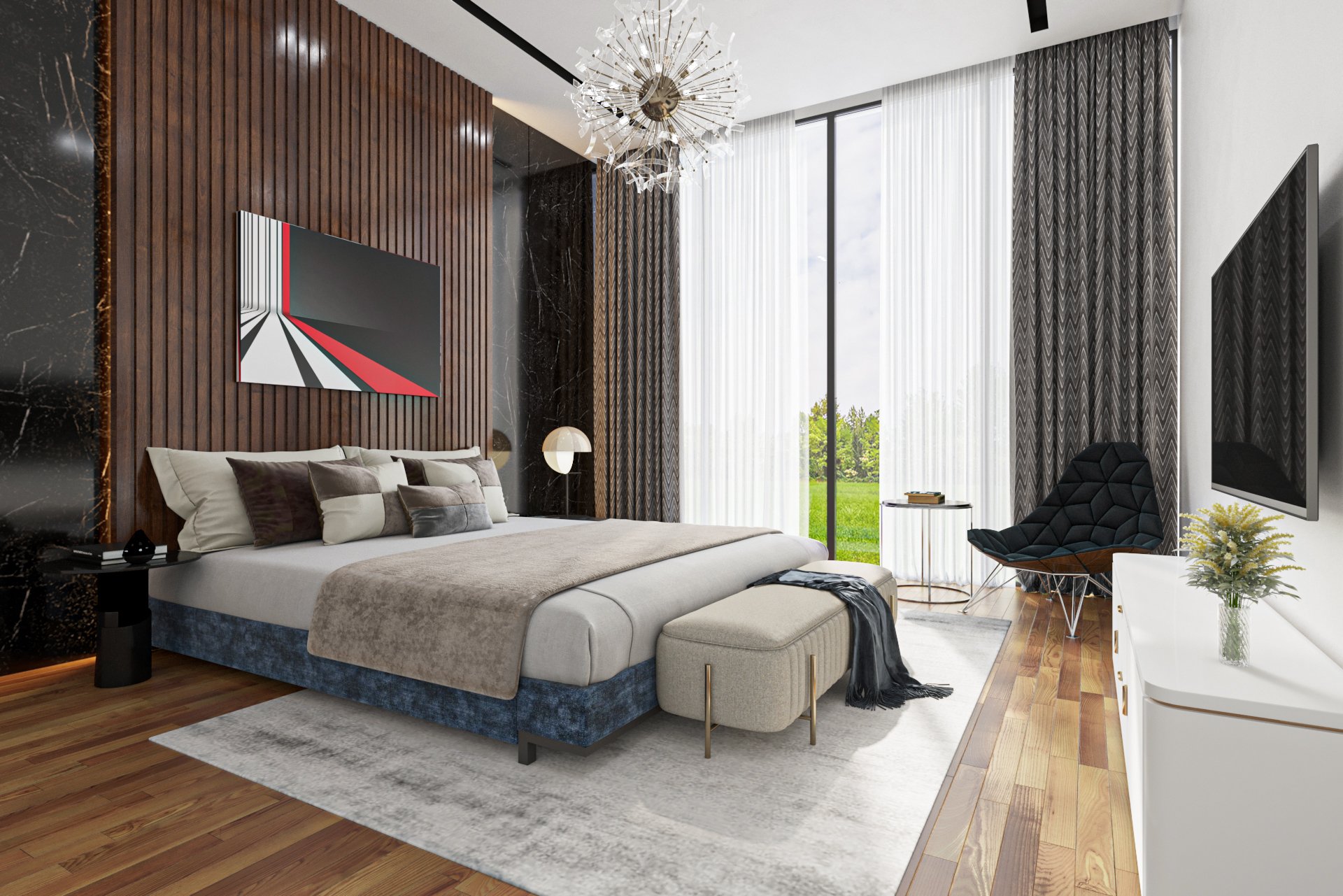
Creating realistic images has been an obsession for artists in the field of architectural imaging for a long time. Moreover, recent advances in processing technology and rendering software have made photorealism an easier target to pursue with any 3D artist. Whether you’re rendering products, designing interiors for rooms, or visualizing architecture, these rendering hacks will make your job easier. Before you know it, no render project is too small or too big for you.
1. Round the edges
A simple one to start with – round the edges. There are so many impressive architectural renders that still use geometry with sharp edges. Perfectly sharp edges do not exist in real life, and should not exist in 3D. Rounded edges improve the way that light and reflections affect an object and give smoother more natural highlights.
2. Use surface imperfections
Take a close look at any surface around you in the real-world. You will notice dust, smudges, scratches, dirt and various other imperfections. Yet in 3D, most artists create their materials without attempting to replicate these effects. By using imperfections that make sense in the context of your scene, you can add another level of realism to your renders.
3. Mimic real-world lighting
Light settings are difficult to perfect. They’re usually approximated to produce the best looking scene instead of accurately reflecting the true light characteristics of a space. If you want to achieve photorealistic renders, it is best to mimic the lighting from real-world environments. The best way to create a physically accurate lighting setup in 3D is to first identify all of your light sources. Think about their positions, shapes, colour temperatures and intensities. Once you understand these you can recreate them in 3D, attempting to mimic reality.
4. Texturing – quality is everything
Poor quality is the # 1 downfall of 3D textures; this encompasses blurry, undefined, extremely small or pixelated textures. One key difference between a good model vs bad is the quality of its components. You cannot get realistic results if the resolution of your texture is not detailed enough. The higher the resolution the better the material will look. This means close-up shots will look impressive.
There is one more thing: seamless textures. Visible repetitions may reveal carelessness in choosing a texture. There are many websites that share seamless textures, but if you don’t find them it is possible to fix this repetition using image editor software.
Also, make sure that the texture is on the right scale, textures being too small or too big can make your render look impractical. You can search or use real-life examples around you for reference.
5. Scale objects correctly
One of the easiest ways to tell that a render is fake is incorrectly scaled objects. This is particularly true for elements that we see everyday, such as people, cars, furniture and architectural elements. So, set your units to a measurement that you are comfortable with and when you create or import a model double-check that the scale matches up with the real-world.
It is not just the scale of objects that you need to be aware of but also of textures. UVs objects and tiling materials must represent the real-world scale accuracy of the material. You should check that the direction of the texture is correct and that it is not repeated or tiled. If you do have a texture that is noticeably repeating, you can replace it with a larger texture. Or if this is not an option, another technique is to copy it, offset it and use a noise map to mask it over the original texture. This will create more variation and prevent textures for appearing tiled.
6. Camera and settings – find the right angle
One of rendering hacks for achieving a realistic photo is to properly compose. Even if you have a stunning model but the camera set-up is not correctly positioned, then your render can still look bad. The role of composition is to create a visually appealing structure for the photo. However, composition, angles, what to show: these are all very personal decisions. Thus, it is interesting to observe which features you enjoy in their work and then try to create your own style.
7. Pay attention to the details
Our last tip of rendering hacks is to – pay attention to the details. In the real world, it is uncommon to see a room perfectly organized or an object flawlessly clean. If you are constantly trying to avoid imperfections on a piece of furniture or unorganized supplies in your interior design, you might be holding yourself from progress and creativity.
First, take some time to look around you and try to find imperfections and details that exist in the real-world but not in your renders. Do your interior renders have light switches, plug sockets or a fire alarm on the wall? Do your exteriors have road markings, manhole covers or dead leaves gathered up by the kerb? If not think about incorporating these extra little details, they could make a big difference.
Second, when decorating the scene, add a little twist, turn and move the objects slightly in order to be not perfectly aligned. It can be adjusting a stool, adding surface imperfections, chamfering the edges of a brick wall, leaving one drawer open, or placing an open book on a table. This method will give the scene more personality hence making it more realistic.
We hope this post gives you some new rendering hacks to try in your next set of architectural visualizations and helps you elevate your work to the next level.
Alternatively, if you want to find a company that create 3D rendering for your upcoming project, we- Home3ds would love to cooperate with you !

